Casa Andreoli Holiday Retreats Website Design
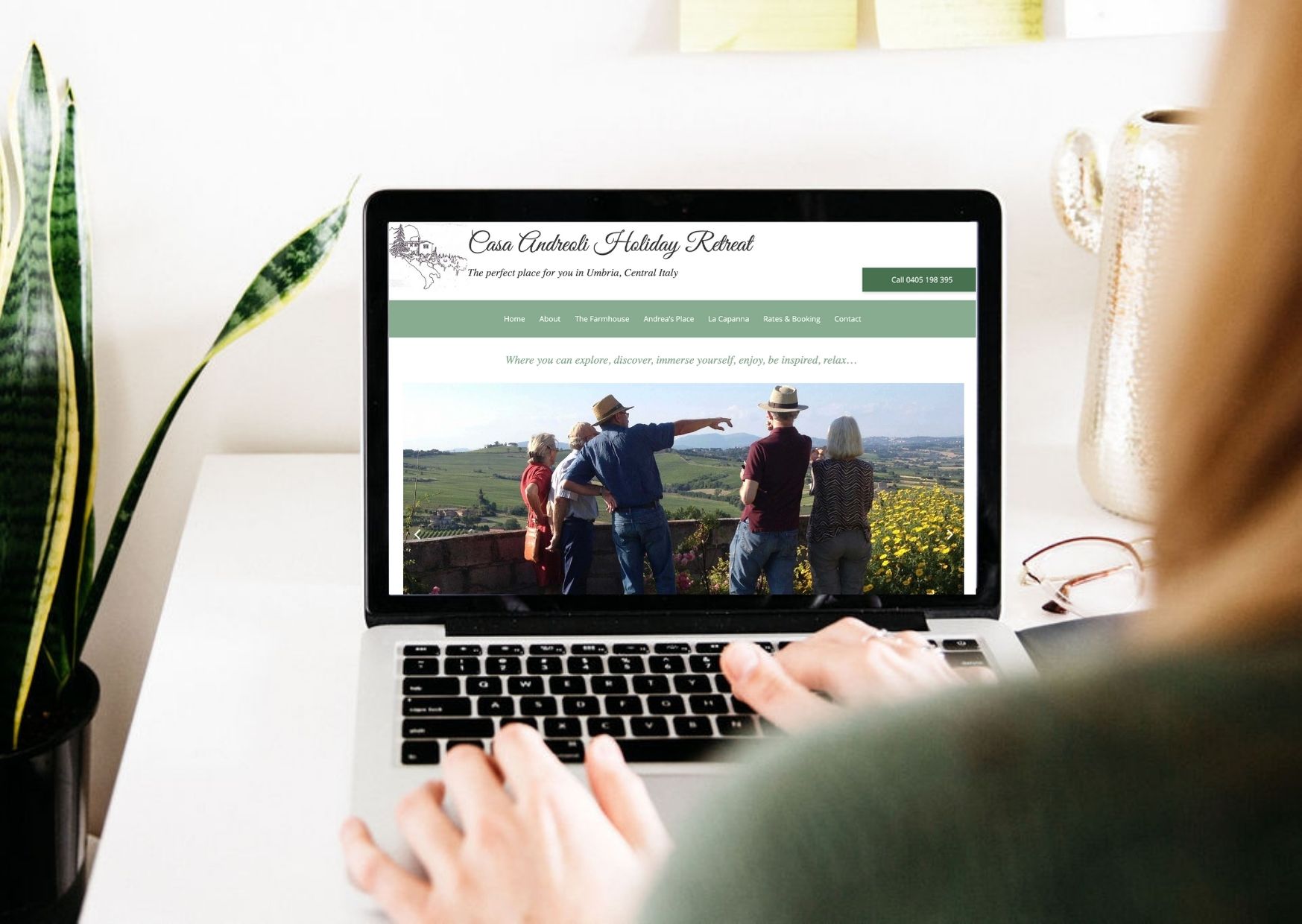
Casa Andreoli Holiday Retreats is a beautiful accommodation option with three properties located in the region of Umbria. Located 2 hours from both Florence and Rome, Casa Andreoli Holiday Retreats provides the perfect escape for travellers looking for your next Italian holiday.
Project Launched: July 2019
Project Requirements: Design, On-Page SEO & Increase Sales
Project Overview
Trish, the owner of Casa Andreoli Holiday Retreats wanted a website re-design that represented her business, develop a logo, increase visibility on search engines, making booking the accommodation easier, and more images of the property, surroundings and nearby attractions.
Key Themes And Styles
New Brand Styles + Layout
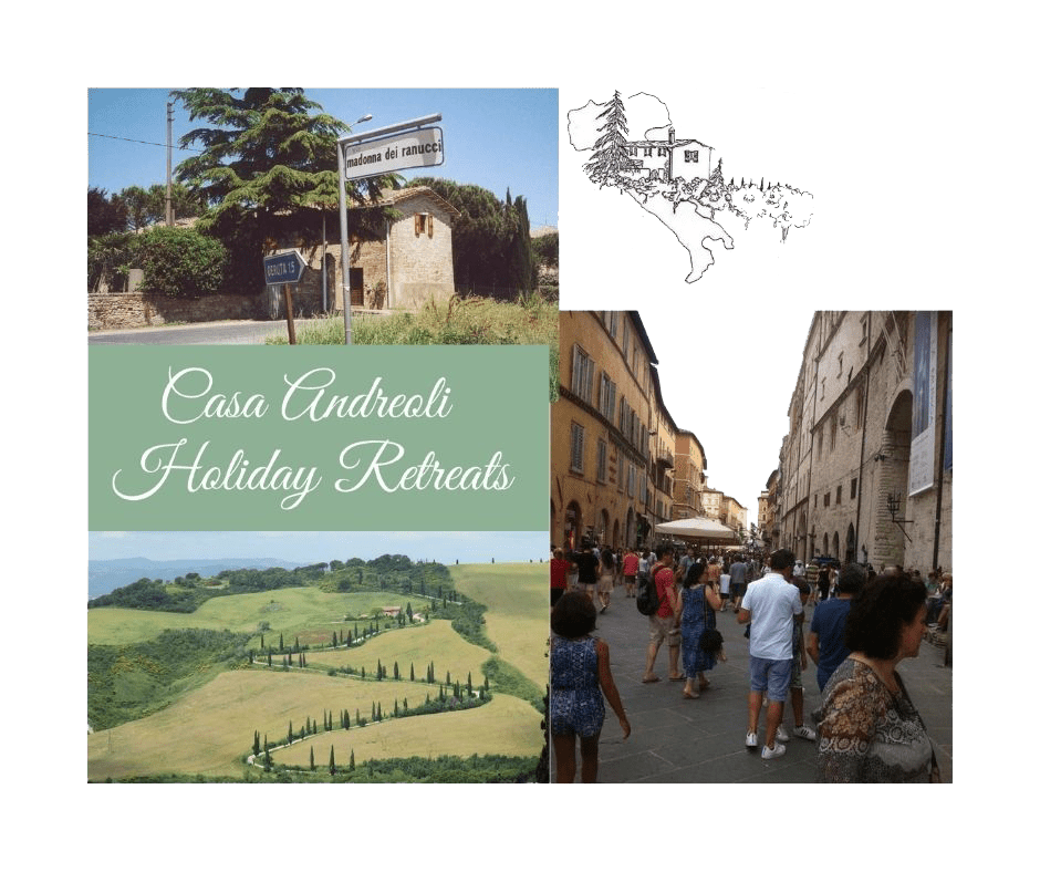
Casa Andreoli Holiday Retreats Website Design is to update the websites fonts, colours and logo to reflect her brand and allow her website to reflect Italy, where the holiday retreats are located. The owner sketched her logo, and I formatted the logo so we can use it on the website.
Images
Trish had an array of great photos from of her property, the local area and nearby attractions that she wanted to display on her website. I re-formatted, renamed and uploaded her images onto her new website.
Booking Platform
Trish also wanted to simlify her accommodation booking system and make availability visible to her customers, making it easier for them to book.
Calls to Action
Trish wanted to make it easier for her customers to contact her directly, book a date and pay for her accommodation efficiently.
Moodboard
What I Did
1. Design + Development
I worked very closely with Trish on the design and development on the website so it was easy for her to use and that it represented her website well. During this process we tried a few different accommodation booking platforms and choose one that was easy for both clients and owner to use.
2. Images
Trish had many great images of her property, the local area and nearby attractions from her frequent trips there. These are great and were great to show her audience what it would be like to holiday here. We displayed them in different formats across her website from still images to slide shows.
3. Call-to-Action
I simplified the booking system on the Casa Andreoli Holiday Retreats website. Changing it from a contact form on her website, to showing her booking calendar so they could see what dates were available. We also made it super easy for clients to call Trish directly to book their holiday.
The Results
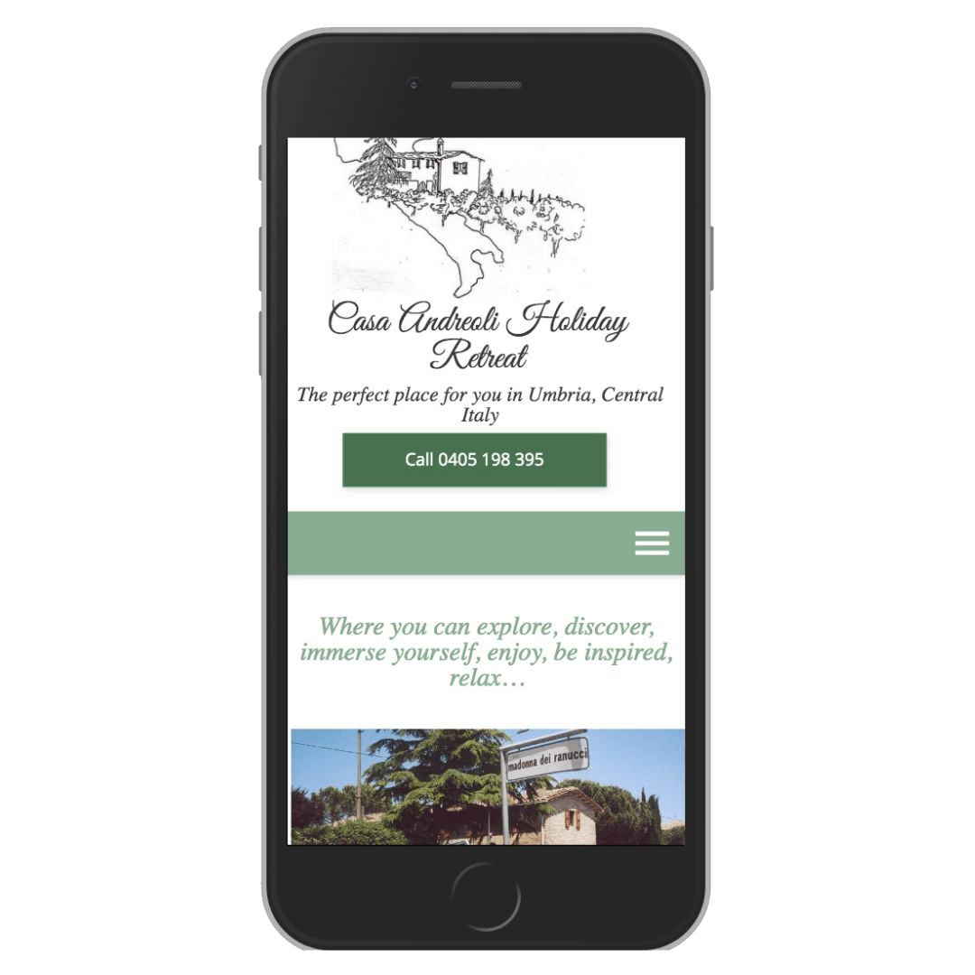
The Casa Andreoli Holiday Retreats Website Design had the look and feel the owner Trish was wanting for her website and it displayed her accommodation correctly to her audience.
Trish had an accommodation booking not long after her new website launched.
Trish is able to share new bookings with her team over in Italy, easy with the system we created, so they knew when new guests were checking in and checking out.
The design made it easy for her clients to contact her to enquire or book her accommodation by having call to action buttons like “Book Now” and “Call 04XX XXX XXX” on all pages so clients can contact her in the method that worked best for them.
The design encorporated her hand-sketched drawing of the main house in the Italian countryside as a custom logo on the website and to identify the brand.
Testimonial
“Natalie helped get my webiste looking how I imagined. It now has an Italian feeling in the design that I was looking for, and I’m able to show my customers photos of the accommodation and local attractions. She also set up a booking system so my team in Italy can see when guests are checking in and out. I highly recommend Natalie.”
Trish, Casa Andreoli Holiday Retreats

Want to book in a time to discuss the ideas for your new website?
If you have some great ideas for your business that you want to show to have on your website, book in a time for us to talk.
